top of page

Carry The Fire
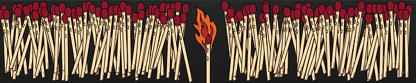
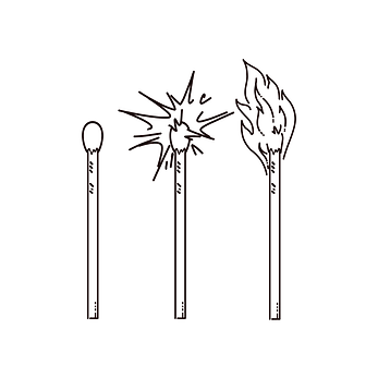
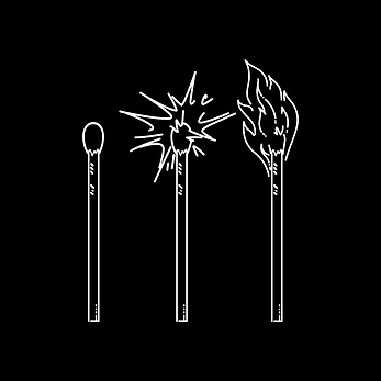
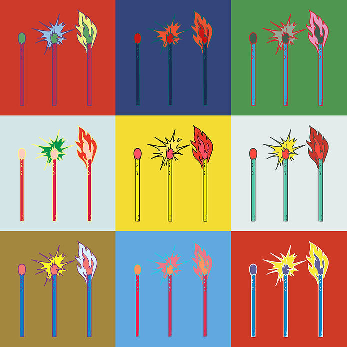
For Carry The Fire — a creative collaboration between another pastor and me — we needed a logo that felt meaningful without being loud. The concept we landed on was simple but striking: three matchsticks in progression, symbolizing the spark, the flame, and the fire passed on. It reflects our mission to share ideas that ignite something deeper — whether through writing, conversation, or creative work. The minimalist design works beautifully across digital and print, and the symbolism keeps the heart of the project front and center.
If you're interested in reading more, check out carrythefire.info
bottom of page